RENOVATION AND EXTENSION OF THE HONG KONG MUSEUM OF ART
Project details
- Building Type
- Public Buildings
- Application Type
- Facade
- City
- Kowloon
- Country
- Hong Kong
- Architect
- Architectural Services Department, Hong Kong SAR Government, Hong Kong, China
- Colour
- [tectiva] TE10
- Finish
- Regular
- Special applications
- 3D, Special shape
- Photographer
- iMAGE28, Daniel Wong
Project description
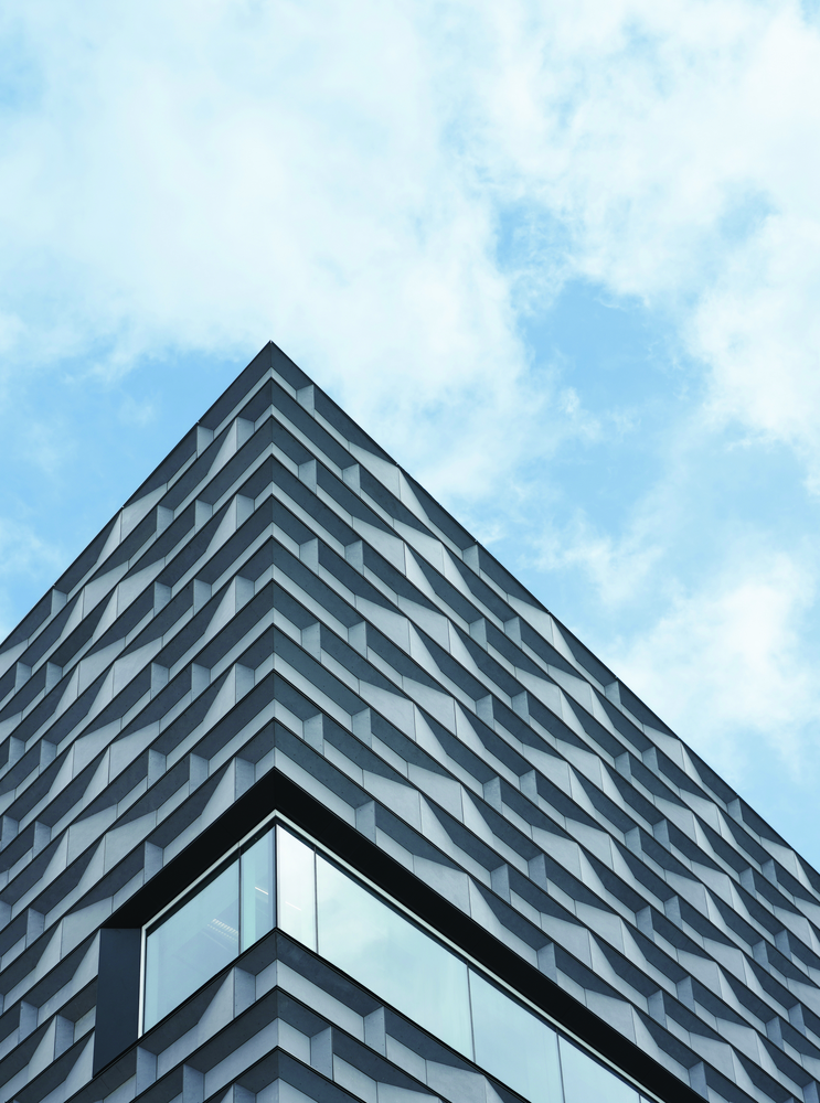
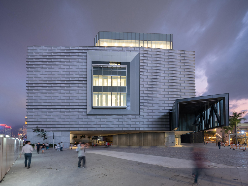
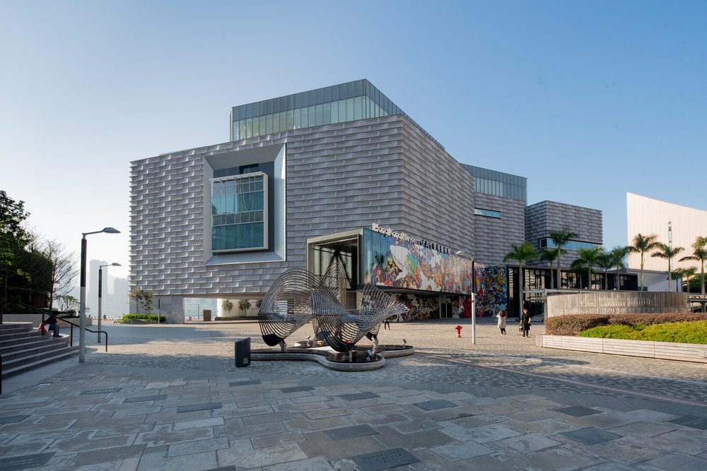
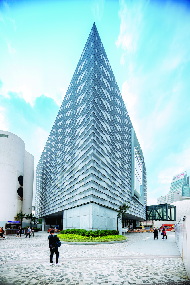
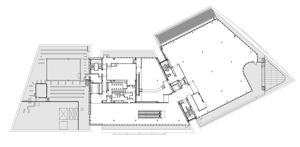
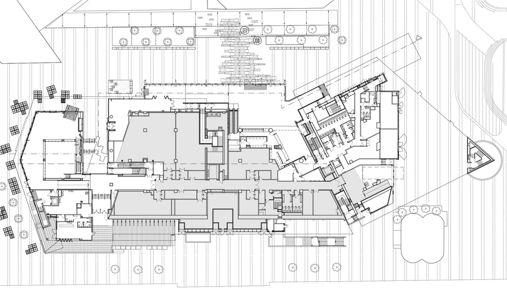
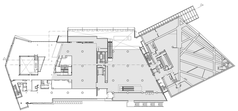
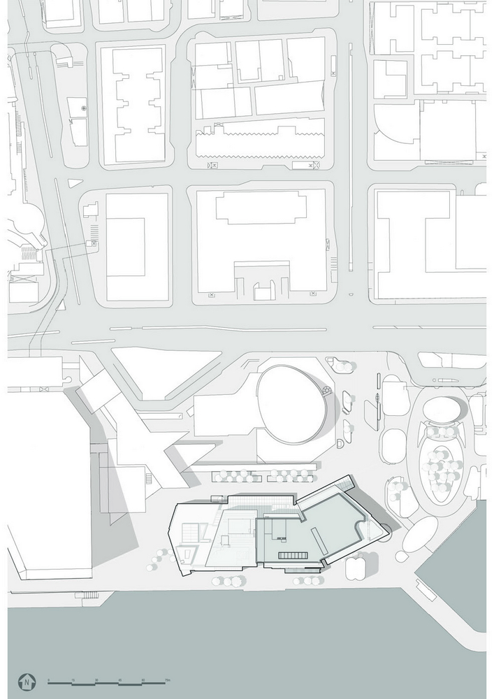
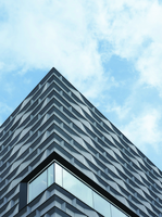
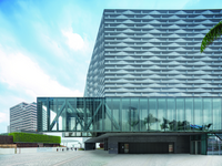
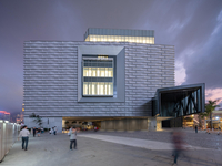
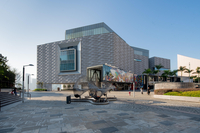
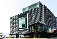
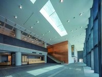
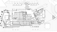
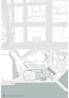
At first glance one could easily believe that Hong Kong has surreptitiously acquired a completely new Museum of Art. But in fact, the core of this museum still consists of the 23-year old building that could no longer cope with the urban design changes in its surroundings. But instead of simply erecting a new museum, the government decided to completely renovate the old building and to give it a striking extension. With this aim in mind the cubic forms of the original building were strongly emphasized and connected with the surroundings by new glazed insertions and additions. This building was also given a new hovering canopy above the main entrance and two recessed storeys as an extension. Numerous earlier additions to the introverted old building were removed, while framed glass facades extending through several storeys were made on the west and south sides and offer a view of the port and of public space. Through a variety of design interventions, a rather unexciting 1990s building faced with ochre-coloured brickwork has been transformed into a modern museum in which the new facade immediately grabs your attention. Modularity and a three-dimensional quality shape the character of the completely newly designed elements: grey fibre cement panels were cut to predetermined sizes and were mounted on site on an aluminium substructure. The completed modules were then fixed to the reinforced concrete loadbearing structure. To allow maintenance or service work be carried out they can, if necessary, be taken down individually. In conjunction with the reworked concrete facade at ground floor level and the separate framed areas of glazing in the facade, the building now conveys an exceptional impression of depth. In this sense one could truly say that an entirely new building has been made.
The waves in Victoria Harbour and China’s traditional brick architecture provided the models for the design of the new facade. The modules made of fibre cement panels were mounted staggered in relation to each other. The different ways in which the panels are mounted, some vertical, some splayed and some parallel to the concrete construction behind, give the façade a fascinating, wave-like appearance.
The modules use a variety of aluminium profiles specially produced to form the substructure for the grey fibre cement panels. Each module hangs from three rectangular profiles, which in turn were fixed to the existing reinforced concrete structure by means of a conventional support construction. Cover strip fixed at the top and bottom of the modules create shadow joints and thus become part of the three-dimensional facade.
Published in A+D 54, Autumn 2020
